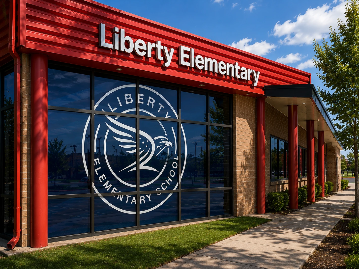
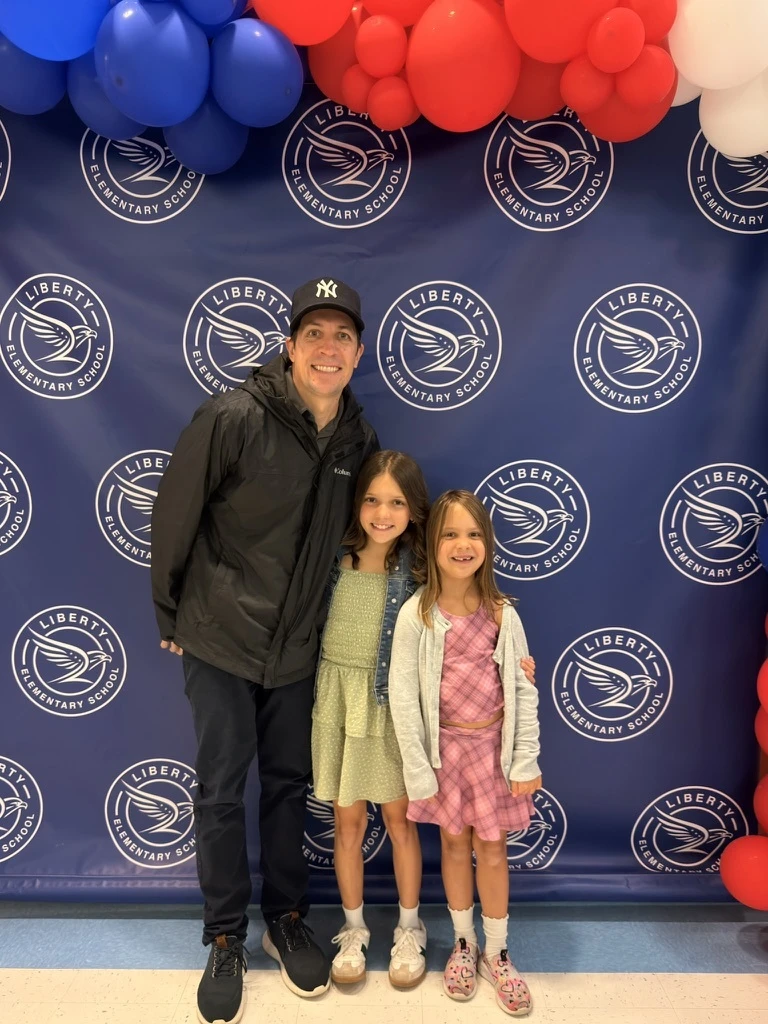
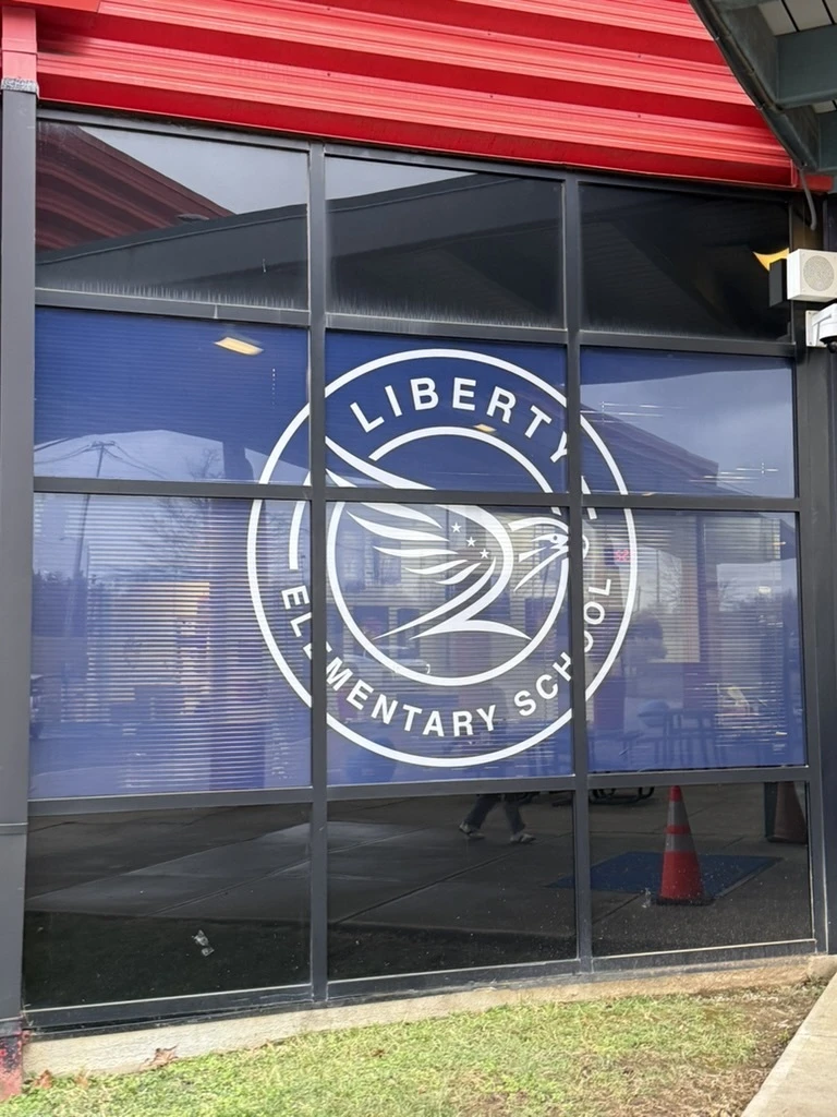
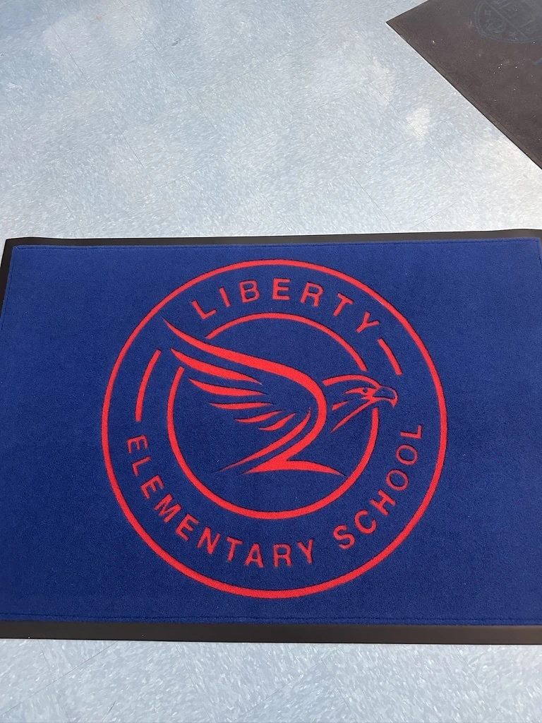
Designed brand identity and environmental branding for the Liberty Elementary Hawks, giving the school its own recognizable presence.
THE CHALLENGE
AUTONOMY WITHIN THE SYSTEM
As one of Lexington’s Spanish immersion schools, Liberty Elementary School (LES) needed its own identity, a distinct, memorable brand that students, families, and staff could rally behind and recognize instantly. The challenge was to establish that autonomy without breaking from the Fayette County Public Schools (FCPS) system it belongs to: a look that stands on its own, yet still reads as unmistakably part of the district.
THE ACTIVATION
FROM MARK TO ENVIRONMENT
We built the Liberty Hawks logo as the anchor of the school’s identity, then extended it into the physical space through custom wall wraps and displays throughout the building. Every application reinforced one consistent look, mark, school colors, and typography working together across hallways and common areas, so the brand feels intentional the moment you walk in, gives LES a presence entirely its own, and still sits naturally alongside the broader FCPS system rather than competing with it.
THE IMPACT
A COHESIVE IDENTITY STUDENTS WALK INTO EVERY DAY
The result is a clean, confident brand that gives LES a strong sense of place, pride, and autonomy. Students and families experience a consistent visual environment from the front door onward; the school gained a flexible Hawks identity it can carry across signage, apparel, and communications, and FCPS retained brand consistency across its schools, proof that focused, thoughtful brand work can give an institution an outsized sense of identity within a larger system.
With your superstar PR work, we've been able to scale our Clutch Coffee franchise up to 10 stores, and have also been featured on every major local network ABC, NBC, CBS and WB. The Seidel Agency PR team also hit the hat trick with QSR Magazine in terms of booking for me a Conference Keynote, Top 40 under 40, and multiple features for Clutch Coffee Bar. Without your PR since day one, we wouldn't be where we are today.
Dr. Josephine Polich
★★★★★
Cearna Aesthetics
Steve and The Seidel Agency is different. They give their heart and soul into every project, are fabulous to work with, and work exceptionally hard to please the client. He is someone you can trust to care about what you want in the product and he strongly believes in doing the right thing every time.
Kate Illulian
★★★★★
Co-Owner Fox Hall Steakhouse
Worked with Steve and the Team on marketing our new restaurant and they got us so much buzz. They know what they are doing and got us all the top bloggers to come in! It's been a pleasure working with them.
Lane Li
★★★★★
Owner Noodle Lane
Sales have been growing with big increases after publication. Appreciate all the work you're doing.
Brandon Lee
★★★★★
Founder Train for Transformation
I highly recommend the Seidel Agency for all of your branding, media, and PR support. Our brand awareness video that he directed for our company helped us raise our visibility and exceed our financial goals. Keep up the incredible leadership, and we remain in gratitude for all you do!
Kerstin Reichert
★★★★★
Head of Marketing SeedLegals
A very big thank you to Steve and Megan for supporting SeedLegals' US launch. The work you've produced for us was outstanding, communication always incredibly fast, detailed and super helpful. We've achieved great coverage across news outlets, blogs and podcasts. And it always felt like working with our extended team rather than an external agency. Thanks a lot for all your incredible work, responsiveness and guidance on navigating the media landscape. We're super happy with the results we've achived together and look forward to collaborating again in the future.